When David Anderson visited us last month, he mentioned that we must make sure project policies are explicit by writing them down. Recently, I had a some sort of epiphany that some of these policies could be visualized as well – directly up on the wall.
I prefer a whiteboard and post-its for our Kanban wall, at least as long as the team is co-located. This gives us an instant overview of the flow, and we gather around it to discuss how to optimize the throughput. It’s simple, but flexible.
To keep track of lead time and cycle time we update the tickets with important dates as we move the tickets across the board. However, I noticed that tickets weren’t always updated with necessary information for my statistics, so we needed a better approach.
First we standardized the way the tickets look, with fixed places for different items, but routine glitches still happened every now and then. Then we started to visualize the criteria for moving a ticket to a new state.
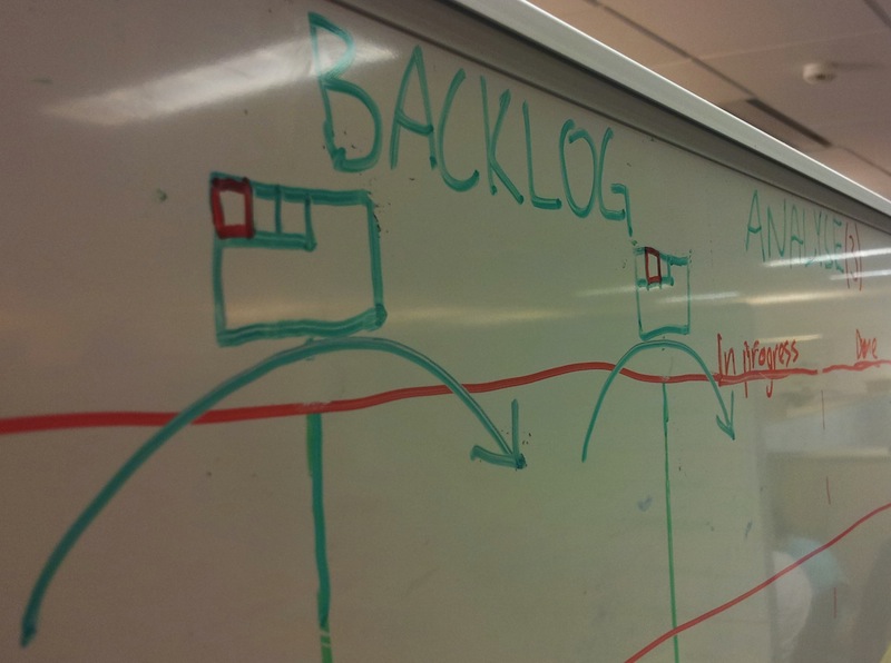
First arrow in the image above shows the transition when the ticket is prepared and moved into the backlog. The person moving the ticket fills in the current date in the upper left corner (the red square). Similar happens in the next transition from backlog to analysis.
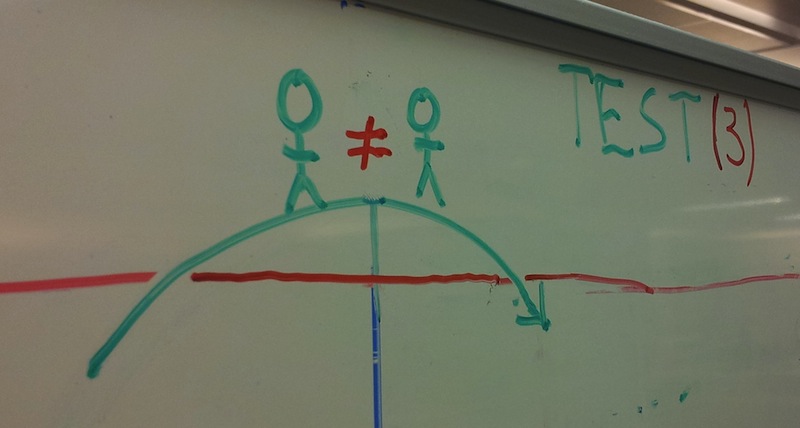
When moving from development to test, another person must test the new feature (or defect).
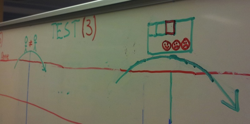
When tickets are done, the completed date is added, accompanied by a subjective well-being using  ,
,  or
or  . The latter is later used in the retrospective.
Most of these visual elements were added just a couple a weeks ago, but so far the notation seems to be easily understood and effective.
Are you visualizing any of your project policies?
P.S.: Thanks to Jim Benson for a great tip on how to measure the subjective well-being, as an input to the retrospective.
Disclaimer: This blogpost was originally published on a different platform. Formatting may be incorrect, links may be out of date.